La cava del Vino
La cava del Vino
brand sphere
BEVERAGE / LIFESTYLE
type of work
type of work
BRAND STRATEGY / IDENTITY / PACKAGE DESIGN
BRAND STRATEGY / IDENTITY / PACKAGE DESIGN
year
2026
note
self-directed concept project
La Cava del Vino: reimagining the wine boutique through quiet curation.
La Cava del Vino is a wine boutique in Alella that strips away the retail logic of the category — shelves, price tags, critic scores, the rush of transaction — to focus on what matters most: the wine itself and the people who make it. Open daily and arranged like a private residence rather than a shop, the boutique pairs every visit with the curator's time. The name La Cava del Vino — the wine cellar — names the place for what it is, without embellishment.

challenge
To design an identity that proves nothing — that exists outside of time, holds itself with quiet confidence, and feels at home in the lives of those who treat wine as a subject of attention in itself, not as the supporting act of a dinner. The work had to address a particular audience: people who are no longer interested in proving anything to anyone — neither their taste, nor their status, nor their place.
To design an identity that proves nothing — that exists outside of time, holds itself with quiet confidence, and feels at home in the lives of those who treat wine as a subject of attention in itself, not as the supporting act of a dinner. The work had to address a particular audience: people who are no longer interested in proving anything to anyone — neither their taste, nor their status, nor their place.
approach
We replaced marketing myths with documented facts. The identity is rooted in the "personal gesture":
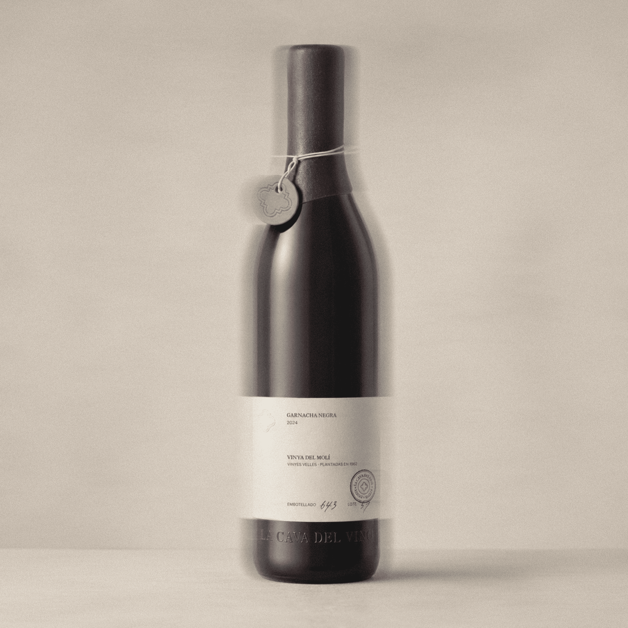
The Living Label: We designed a high-tactility label that functions as a certificate of origin. It features dedicated spaces for hand-written details: the winemaker’s name and the exact date of the curator's visit.
Radical Honesty: The brand voice is calm and factual. We eliminated industry buzzwords like "exclusive" or "exquisite," focusing instead on sensory specifics — the scent of wet slate, the salt of the Mediterranean, and the shade of the garden.
Community by Merit: The identity supports an organic growth model where membership is earned through personal endorsement, not purchased.
We replaced marketing myths with documented facts. The identity is rooted in the "personal gesture":
The Living Label: We designed a high-tactility label that functions as a certificate of origin. It features dedicated spaces for hand-written details: the winemaker’s name and the exact date of the curator's visit.
Radical Honesty: The brand voice is calm and factual. We eliminated industry buzzwords like "exclusive" or "exquisite," focusing instead on sensory specifics — the scent of wet slate, the salt of the Mediterranean, and the shade of the garden.
Community by Merit: The identity supports an organic growth model where membership is earned through personal endorsement, not purchased.


result
The visual language is defined by "tactile premiumness."
Typography: A sophisticated serif inspired by mid-century printing presses, conveying timelessness and authority without shouting.
Materiality: Focus on heavy, uncoated papers and raw textures that evoke the Catalan terroir.
The Ritual: Design elements extend to physical invitations on thick cardstock and hand-signed inserts, ensuring every touchpoint feels like a personal correspondence rather than a corporate communication.
A brand platform that acts as a filter. By using a "quiet" visual voice, La Cava del Vino attracts an audience that values depth, context, and the art of conversation over status symbols. The design does not just package a product; it authenticates an experience.
A brand platform that acts as a filter. By using a "quiet" visual voice, La Cava del Vino attracts an audience that values depth, context, and the art of conversation over status symbols. The design does not just package a product; it authenticates an experience.


© 2026 annwe by Anna Baranova
represented by